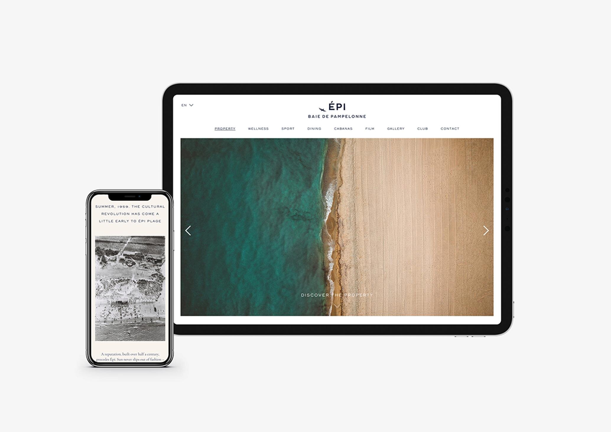
The studio have re-written Épi’s history to create a new visual identity for this iconic destination in the south of France. More than 60 years since it welcomed its first guests to Ramatuelle’s Pampelonne Beach, Épi 1959 is a hotel with a story to tell. Creating a brand identity for Épi, the brief spanned the development of a brand palette, communications and art direction of photography and film: ultimately, refining a visual language to effortlessly combine Épi’s astonishing
legacy with its future-facing ethos.
Taking an unconventional approach, combining logotype and roundel, we created a brand palette and strong aesthetic direction that extends to Épi’s website design, printed collateral and applications, film, photography and brand tone of voice. In combination, the assets communicate this extra-special corner of St. Tropez with appropriate confidence
– and ample differentiation, in a vastly competitive market.
Referencing heritage and the living spirit of Épi in its brand identity, the studio drew inspiration from colour, space and the location’s light for the palette and art direction. The identity conveys a sense of time slowed down and spent well,
a timeless emotional quality at once seductive and evocatively nostalgic of summers past.


